How Taleo, and other job application/listing sites, suck. A place of retreat for the job hunter. Got a tip? Send it to taleosucks@gmail.com.

Friday, June 13, 2008

Finding the job is hard, telling you how I did it is harder

I know why employers ask for it. But why do they make it so painful?

Tell us how you heard about this job

Sometimes it's not really a describable path. Sometimes I don't actually remember (often I use a search aggregator like indeed.com which takes me to all sorts of different job sites. I don't care what the site is which found the job, and since I usually won't apply to it using that site it doesn't matter what the site is.)

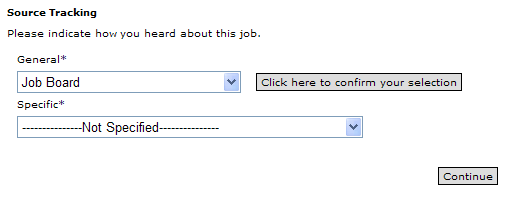
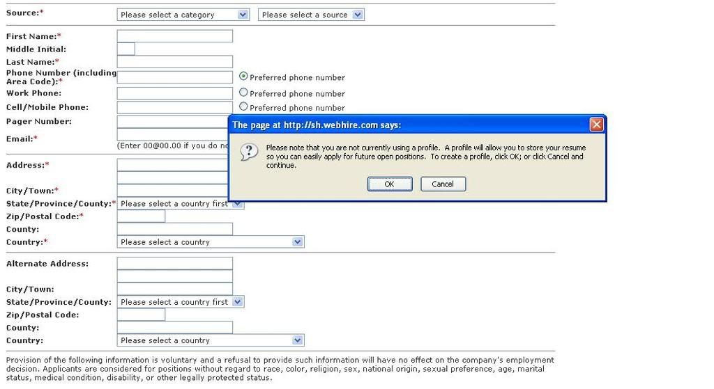
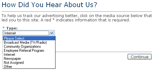
Here is Chase's/Taleo's way of asking the question...


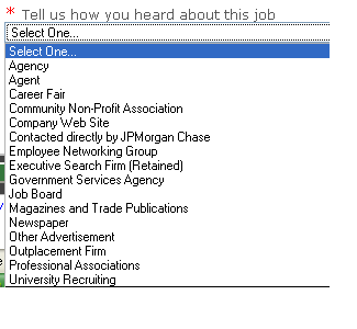
On the surface that doesn't look very painful. Once I select job board...


Gaah! It's a gigantic list (which has also not been recently alphabetized.)

Look, this is not something I need to get right to get a job, so I'll answer it anyway I want--choosing a random entry in the list so that I can move on. If you really want an accurate answer, please don't give me a gigantic list to wade through. I just don't care enough. And clearly, you are unable to list all the different ways I could have arrived at the site because you've been manually adding more choices.

IBM's HR site, in contrast, gives me a text box for the same question. I'll bother taking a few seconds to answer a text box. I might even give you specific workflow detail which might be useful to someone. Yes, that might require a human parsing the data, but it's a lot more accurate than when I told Chase I used chinahr.com to get a job because I was frustrated looking for indeed.com on its list.

But Chase/Taleo aren't the worst offenders in this regard. Delta airlines has them beat.


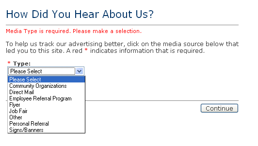
I'll give you what happens textually if you choose any of those selections:

"Community Organizations" has one choice: "Colleges"

"Direct Mail" has one choice: "Direct Mail/Postcards"

"Employee Referral Program" gives you a field for the employee's name

"Flyer" has one choice: "Flyers"

"Job Fair" has one choice: "Job Fair/Career Fair"

"Other" has one choice: "Jobline"

"Personal Referral" has one choice: "Payroll Stuffer"

"Signs/Banners" has two choices "Banner" or "Point of Purchase Display"

Now this really isn't a problem for me personally, because I can choose anything and it's no sweat off my back. However, the entire thing just plain sucks and might explain a lot of the problems with the airline industry.

a.) Almost everything there has one selection. So why have sub-categories. Instead, just give me the sub-category for such a small list.

b.) Almost every conduit for getting to the Delta's career site isn't listed...including the way I got there which was "I like airplanes and Delta came to mind because they have airplanes so I went to their site."

c.) The conduits listed don't make any damn sense. I guess in a vague way Colleges are Community Organizations, but that's not my first association. Personal Referral leading to Payroll Stuffer sounds like an internal thing so it should be listed as an internal thing (and worse "Personal Referral" sounds like someone who works for the company recommended me which is actually covered by "Employee Referral Program." Signs/Banners is just lame, particularly given the fact that one of the selections is "Point of Purchase Display" which, in terms of airlines, is bizarre, given that the Point of Purchase for the things that Delta sells are a myriad of travel websites.

UPDATE: Just as I was looking for another screenshot, I see that when I choose a different job I might get a different list...


Oh, well that looks a bit more promising. I wonder what choices are found under Broadcast Media?


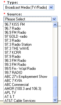
Oh bother. And yes, the list just ends there. I actually suspect the full list is every TV and radio station in the US, or damn close to it.

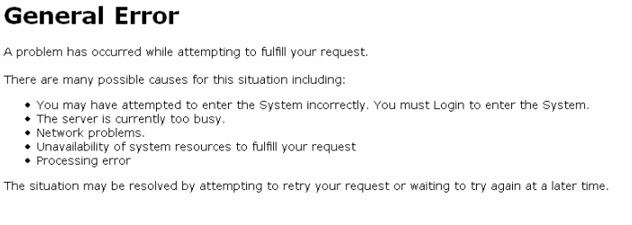
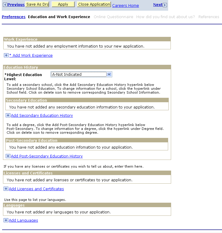
Delta's site sucks in other ways as well. Sometimes I like to be able to add particular jobs to tabs in my browser and look at them later.


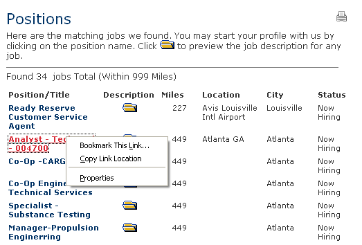
Well obviously that's not going to work because they insist on doing things their way.

Speaking of airlines...I had to laugh when I was applying for a position with United...


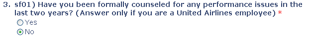
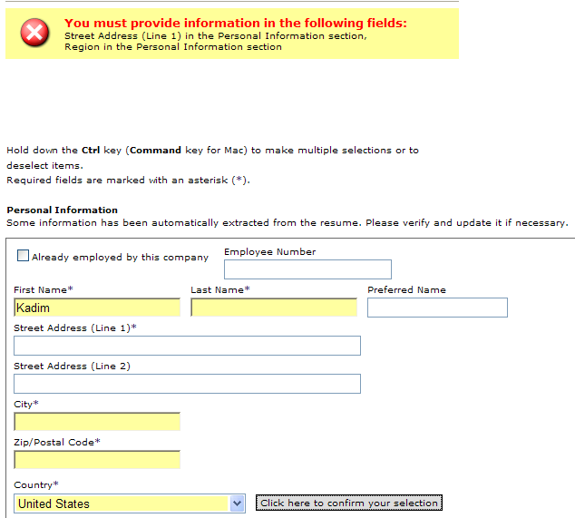
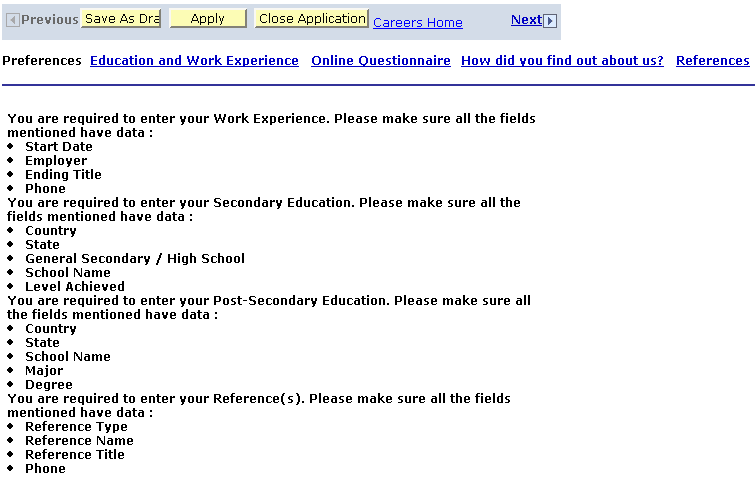
Have to be careful with the power to make questions mandatory to answer. Sometimes, it just doesn't make sense.

Tuesday, May 6, 2008

April showers bring May usability irritations

I had to laugh at Robert Half International's candidate system, which included this moment:


Yeah, I could have solved this issue by saying "Russian and French." (Though the former is a major and the latter is a minor, which this form doesn't take much into account, not that it matters.) However, why does the field need to be so persnickety? Is it really trying to save some massive SQL database from a technicolor yawn if this particular field carries over with a slash?

Robert Half's internal candidate site proves to be an amusement in other regards. It's a relatively large company with a variety of different divisions (for instance, IT staffing and creative staffing.) I happen to be a potential candidate for both divisions, yet the system wasn't meant for that. That leads to situations like this:


I leave it up to the reader to decide the best answer on how many people an IT help desk employee "directs creatively."

Now I might be an odd exception and you have to give every institution the opportunity for handling exceptions. This system has no internal way of doing it (because I can't delete work experience entries already in there) and the local RHIC office directed me to call their help desk, and their help desk goes to voice mail and I just decided to try another company (nothing seemed to fit me anyway.)

Well that other company ended turning me down. The subject header of this company's email...


I know it's hard to design email subject headers that don't look like spam. I don't know if that ticket number makes it more like spam or less so. ("Recruiter Message" however does make it sound like spam.) A better system is to reference the job and the company and to skip the damn identification number in the subject header because the information is not that vital to the job applicant. (Though it's fine in the body of the email itself. Actually, I think Taleo does a half way nice job of this, from what I recall.)

In fact, this particular system has a fairly nice, logical looking email, I'm staring at it right now...


*sigh* Is this really the only way? Well I guess it's not a bad solution from their point of view.

On another job searching expedition, I got this error from a Greatjob.net site (used by Delta airlines)


General errors are ugly, and I imagine that if the system actually knew what the error was, it might have prevented the error condition in the first place. So I concede that sometimes all you can do is throw up an error message like this. (Even though I never encounter a general error message on any other site except for Myspace, which handles an unbelievable amount of input/output.)

I'm arguing with myself over what such a page should say...should it spell out all of the problems that might have lead to such a page (such as this page does) or should it just say an error has occurred and what to do? (In regards to this page, I find the first reason rather oddly worded. "You may have attempted to enter the System incorrectly" sounds like this site requires an extraordinary amount of foreplay.)

In any case, what causes the error isn't very important unless different errors create different solutions. Only error condition 1 may require a different solution...the rest of them require waiting or trying again. My quibble is that the system could make it easier to wait or try again. Like...a link that allows me to try again (at least to take me to the most top page that I could have been at.) I'm complaining about this now because there was no way for me to use the back buttons to go back. That resulted in an epic fail and I had to start from delta.com all over again.

I should also add that it's nice if error messages keep with the design of the rest of the site. The starkness of this General Error message, or of Taleo's version of the same contrasts with the rest of the user experience, and it makes one feel like one's suddenly plunged down a deep dark hole. (Compare Microsoft's blue screen of death with the Mac OS X current kernel panic overlay. The reality is that both indicate that the user had indeed suddenly plunged down a deep dark hole. But the Mac OS X kernel panic overlay better adheres to the interface and that reduces the shock, whereas the blue screen of death can't help but shock.)

I haven't mentioned it before (I thought I did but I can't seem to find evidence of it) but if you are involved in the business of making this type of software, feel free to let me know where I'm completely mistaken. Defend your products if you must, I don't care. Funny, I made this originally as a way of ranting out my frustrations, with the expectation that other people who hate Taleo would end up adding to it. Instead, the statistics indicate that the visitors are almost entirely people from companies who make HR software...so...umm...hello. *waves*

Tuesday, April 1, 2008

more password suckyness: the sequel, or trequel. meh. sometimes there aren' t words

Well now we're back to using Chase and its job application system. If you recall from the original entry on this topic, their password requirements are a bit on the heavy side, so I did indeed forget my password, and had to revisit the issue all over again.

But let's start off with this:


I show that image because I'm amused by their language for what happens when you put in the wrong username. Having said that, I was using Firefox there, so kudos for making the site actually look normal and readable in Firefox. *golf clap*

Eventually I figure out and remember the username I used, but now we have the password issue. As indicated earlier, Chase has an enormously complex password requirement. Since I forgot the password set, I needed to go through some procedure to indicate to Taleo that it's ok to allow me to reset my password.


Obviously this is something I setup at some point in time. Since my favorite animal is not the man-eating B$5#a3etyQ of Vanuatu, the strength of the password is not exactly being supported by their password reset function.

Which actually, at some level, I'm thankful for. This password reset function is a lot better and easier than it was previously.

But still, the password requirements are still unnecessary:


You know, there may actually be some reason for these password requirements I'm not aware of. Like all banking activities are required by law to have weirdly complex password.

But if you compare the password requirements from what they were when I last wrote about this issue:


They've actually become *worse.* The new requirements add a prohibition of characters being repeated more than twice.

And now that I think about it...why does the character set have to be spelled out to me? Is that because this site is not allowing me to use the full character set in some way? Are there people protecting the sacred privacy of their resume with the character from ALT+0234? I dunno, I find the spelling out of the character set to be "awkward."

Oh, I was able to answer the question from previously. The language says that you have to have at least 4 lowercase letters. I wondered, at the time, if that means that a password like "abc12XYQ5&" would be rejected.


The answer to that is, yes. And I said that is lame, and I still believe that. Even more lame (or is that "lamer"?) the error message rejecting my password doesn't tell me what's wrong with it. I consider that a big issue given the fact that these password requirements are so complex that any one of a number of things could be wrong with an attempted password.

Eventually I do get in, and I'm greeted with a screen showing me previously uploaded resumes/cover letters.


And you know, that's nice, less work for me...oh wait. It says I can only have 3 attachments and I already have 3, so one of them has to be deleted if I want to put in a new resume/cover letter for this position.

Alas, there is no way to remove a file. To be fair, other Taleo sites do allow that, so maybe this is a problem with Chase and the way it's set up its Taleo. (Perhaps this site should be called "Chase HR sucks." Actually, now that I think about it, I have been burned by Chase HR a lot more than I care to think about.)

Taleo uses this odd way of allowing you to go back and forth within a job application session.


Basically, each little box represents an entry page in the session, and the left/right arrows at the end (the left one isn't there because I'm seeing all the way to the left) allow me to scroll beyond other pages in the session. Pages I've "completed" or are next to be completed are in purple so I can switch back and forth between those. (Blech--not consistent, except from the perspective that those are the ones I have "access to." This would be remedied by having a different color on the page I'm working on or I'm supposed to be working on.)

But either way, it's making things more complex. What I want to be able to do is use the forward and back buttons. That doesn't work in Taleo's world and my attempts to do so this day...


Well, at least it looks good in Firefox.

Monday, March 31, 2008

ahh...I forgot about how much it sucks

So, one of the things that makes good sense to me is to open a second browser window or tab when applying for a job. See, that way I can have the job description/requirements open in one tab to refer to, while I'm actually applying for the job in the other tab.


Taleo, of course, doesn't allow you to do that. Why? I dunno, I never run into any other site that doesn't allow this. *Throws his hands in the air having given up on this system a long time ago.*

Back to another Taleo oddity: non-dynamic hierarchical menus

Some websites use a system with a hierarchical series of pull down menus. Choose a menu selection in a top pull down, and then it dynamically changes the selection choices in the second menu. Tirerack.com has a good implementation of this.


So when I choose Ford...


Oh, would you look at that...possible years of Ford vehicles appear. Obviously once I select a year...


A new pull down menu with the actual models for that year appears. It's lovely and intuitive and works well in comparison to Taleo's weird system...


Which for some reason requires that you press a separate button confirming the selection you've made before it propagates the next pull down menu. Honestly, I think Taleo is the only system with this weird setup, why it can't learn from what other sites are doing I don't know.

Finally, I had to be amused by this moment of mediocrity.


It would seem logical that fields in yellow are required. That does seem to be the case, but there are also fields *not in yellow* which are required as well. What's the difference between yellow and non-yellow fields required fields? I can't say. I think it's just a bug. (I think highlighting the yellow is fine, it works fabulously, but jeez guys, make all the required fields yellow.)

Wednesday, March 12, 2008

The uninvited attachment

When you apply for a position via Taleo, they send you a pretty standard soulless form letter telling you that it was received and not to call anyone about your future.


Lovely...hey, what's that extra icon?

Well apparently it's an attachment, and if you click on the attachment, it's basically just an html file that has the exact same text in it.

I'm not sure why that's necessary, or why it's only Taleo that insists on sending me this crap file I don't need--particularly since there's nothing particularly ornamental or complex in design about this email, which is perfectly fine as plain text.

It does lead to this however:


Now I'll be the first to admit, I have Eudora set to keep attachments even if I delete the email. And right now it'll take me just seconds to blow out the detritus of those 47 other failed attempts at applying to one company or another.

But why does this have to be this way? I don't get crap attachments from any other company that sends me email.

For the most part.

Sunday, March 9, 2008

More password suckyness and another deficient system

I had to establish a new password on Taleo's site for Chase.

The password requirements are:


Now to be fair, Chase has decided on the password strength--other Taleo sites do not have this requirement.

These requirements are maddening, particularly because I try to use the same username/password for all Taleo sites (what's in my profile is basically my resume and contact information. Information which I'm not all that worried about protecting, especially considering the fact that there's more about me in public records than what Taleo stores in its site about me.)

Even more maddening, considering the inconsequence of the information stored, these requirements are more than what Chase requires for password strength for online banking (which actually might deserve password requirements like these.)

And a nitpick--all of my "hard" passwords are more than 12 characters long. If you want high password strength, why restrict the length of the password?

I also can't tell if the language "must contain 4 lowercase letters" implies that a password like "abc12XYQ5&" would be rejected because it only had 3 lowercase letters. That would be lame. And if it's not lame, that instruction box is lame.

I'd try to find out by changing my password, but by now I've already forgotten it.

I applied for a job with NiSource which uses, apparently, a Peoplesoft system for taking in job applications.

This could be a good system, if it didn't do a few things that I thought really sucked.

Starting with this confusing screen:


There's something about the design of this page that makes things a bit obtuse. The copy explaining what to do is terrible ("To add a secondary school click the Add Secondary Education History hyperlink below secondary school education.")

The workflow is odd (I think education is a better choice to add before work experience, not after...note, this system doesn't do importing from the resume so it's a lot of repetitive work) and the letter codes in front of the selections with "Highest Education Level" make me think I should be matching them up with something.

Also frustrating, I don't know why they insist on using the terms "secondary" and "post-secondary" to refer to what's normally just High School and College. The reason I find their terminology confusing is that, often, these types of websites don't bother asking where you went to high school. And while I understand that "secondary education" has historically referred to high school, I find that usage bizarre and archaic given the fact that the entire K-12 experience is, today, considered holistically one thing, and then college something afterwards.

So I assumed, incorrectly, that "post-secondary" referred to graduate school. Once I had that straightened out, I found myself chuckling at the following:


Why does this need to be a drop down list? How does that help anyone? Why can't you just have it as a field? Oh, it might make sense as a drop down list, if that list then filtered the schools in that country for the next drop down (a terrible design for higher education given that there are so many...just give me a damn field to enter this information into!) But no, it's not a filtering mechanism, this is just a drop down field with every country in the world listed.

Like Vanuatu. The inclusion of Vanuatu is not done in vain; there is a university in Vanuatu.

However, as far as I can tell, Western Sahara doesn't have a college or university, and neither does Tuvalu. Wikipedia says that Wallis and Futuna has an unaccredited university as of 2005, which by all means puts them ahead of Tuvalu.

You're allowed to click through all the screens to the end without entering in any information. I thought I was going to get off easily until...


Damn. I kind of appreciate it allowing me to click through mandatory information but then again I think I would have appreciated more knowing what was mandatory and what wasn't at the beginning.

Amusingly, once I did enter in the information it wanted, this error screen still came up, though it allowed the information to be submitted. Strange.

Tuesday, January 29, 2008

Nice registration page and upload limits

Today I applied for a job with an employer who uses Kenexa/Webhire.

When I got the main application screen, I was greeted with this:


Hallelujah! Amazing! Beautiful! I could set up a profile or not setup a profile!

Even more impressive, it asked me just those questions shown on the screen. I could then copy and paste in my cover letter, copy and paste (or upload) my resume and I was done. It took me a couple of minutes to do something that a similar Taleo system would have taken me ten.

This system allowed me to apply for all jobs in my "cart" simultaneously with the same information. I'm not sure if that's entirely appropriate, because different jobs demand different cover pages and perhaps even resumes. But if you're using the same information for all of the jobs, it's pretty cool.

This is also a system that does resume translation--it takes only certain resume types in upload and then tries to render that for itself.

My resume is formatted quite differently and always fails this--I really prefer uploading it via .pdf because even Word seems to choke on it from time to time. That's my problem but at this point I'm tired of sending out boring resumes. (Actually, this system didn't do a half-way bad job of rendering it.)

It really would be better off leaving it in whatever file form it comes in, and just letting the person on the other end open it up in the appropriate program (like Acrobat or Word.)

It did have a 500kb upload limit. My first comment on here complained about Taleo's unjustifiable 100kb upload limit. I agree, it is a bit on the small side.

Thursday, January 3, 2008

Registration pages suck

This blog went through the reasons why registration pages suck, and what a good registration page looks like. It's tangentially related--sometimes all you want to do when applying for a job is send in a resume and be done with it.