The first starts off with a Taleo complaint. Keep in mind, I'm not sure if this issue is caused by Taleo, or the hiring company, who has not well-configured its setup.
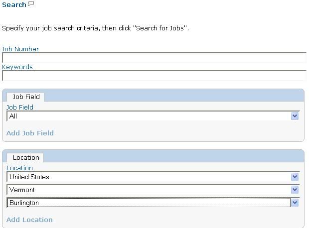
This comes from the initial Taleo page for a random company (it's actually Kroll, but that's important here.)
The fact that I can immediately begin searching for jobs by narrowing my search down to jobs in Burlington, Vermont implies to me that there are jobs available in Burlington, Vermont.
There aren't any. In fact, they only have jobs in probably 3-4 cities in the nation, meaning that just about any city you choose in that list will lead to no results (or jobs which have no particular geographic location.)
Definitely not a user-friendly or logical outcome. If there are no jobs in that location, please don't allow me to search for it.
My next series of complaints come from some sort of SAP system, as used by the airline Jetblue.
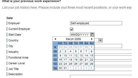
The little calendar pop-up is often a welcome when making airline reservations. I can hone in on a date by looking at the month and such.
It makes little sense here, because often times I don't know the exact date work started or ended. I don't think the employer really cares either. Worse, my instinct was to use the calendar, until I needed to enter in a date for 2007, and the only way to get back to 2007 was to go back one month at a time (clicking for each month on the back arrow.) I quickly gave up on that and entered the date (well, a date) in the box.
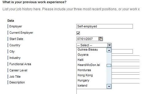
Which brings me back to something I've complained about before. Pull down boxes for countries. Completely unnecessary: they slow the job-seeker down annoyingly to find a particular country. Look, if the job seeker worked in that country, they can likely spell the country in an open form-field.
This particular list does not have "United States" as the top listing. While I'm not suggesting that USA need appear at the top of all these lists, given the fact that this is an American company and mostly Americans will be applying, there's no reason why all these job seekers have to scroll all the way down the damn list.
But I am grateful that they did have the Heard and McDonald Islands in their job list, because you never know who will need to note that a job they had was on one of two uninhabited, barren Antarctic islands.
Did I mention they're uninhabited? As in no people. No population. None.
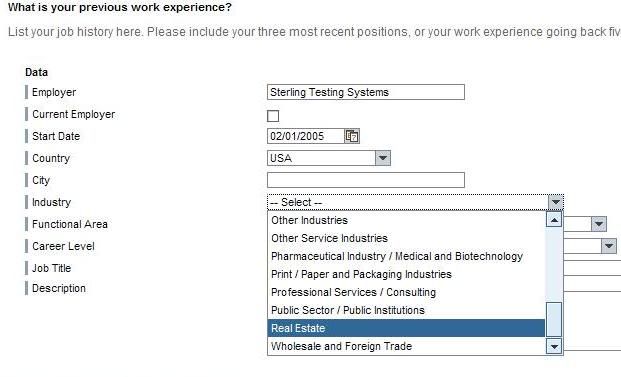
When entering experience, this system wants you to categorize the industry that you had the job in. I hate doing these things, because the categories are often not particularly standardized. (Example: Most of the time "Human Resources" is a top level category. On this site, it falls under "Other Services" which is where I think "Real Estate" should fit.)
Incidentally, I found the listing of jobs on the Jetblue site unreadable in Firefox and Chrome. Not pleased.
I'm going to continue picking on SAP, and for good reason. Their error messages are fabulous:
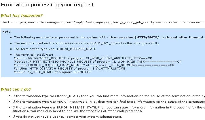
This is basically a session time out on the First Energy HR site. SAP continues to deliver some of the worst error messages ever.
Let's go back to the main site so I can get a session working, and start looking at jobs:
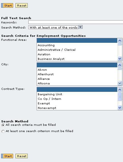
It's not very obvious how you're supposed to just browse for jobs. You can do so just by pressing the "Start" button, which I guess is searching for jobs with no criteria selected, as indicated by the fact that the three boxes have a field highlighted which is blank. I'm sure this was put together by some very bright database-head, but it's unintuitive and stupid.
Now here are my results:
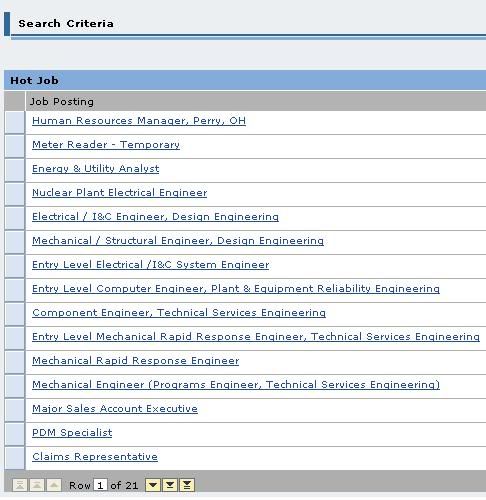
This page is so unintuitive and badly setup, it makes me cry. I can feel my blood pressure rise, and I don't even eat that much salt.
First of all, it's not obvious that there are more jobs which are available, but I can't see. Each job is a "row" and 15 rows are displayed, so there are six more jobs which aren't being shown. I could figure that out by counting the rows displayed, and seeing that there are six missing, or I could figure that out by the three yellow buttons at the bottom (which are, in order, next row, next page and last row...I'm sure you didn't need me to explain that because it's patently obvious based on their design.)
I don't know why it says "row 1 of 21" because no row (or job...why don't they just fucking call it a "job"?) is actually selected.
I know why they won't call it a job, because it's some lame database that's been hacked together to work as an HR application system.
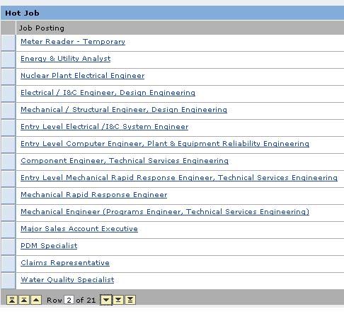
Since the jobs aren't numbered, it's not obvious where I am in the list, unless I figure out that "row 2 of 21" indicates that job 2 is the first job listed at the top of the page, and that 1 job from the top isn't dispayed, and 5 others are not shown from the bottom of the list. I don't know why I am given buttons to advance by pages, because it's not particularly obvious that this system thinks of things in terms of pages of 15, since it's so damn fascinated by rows. (And how would I know that pages are broken down in sets of 15 rows without actually counting the rows? And at what point would I give up on First Energy when I realize I'm counting jobs on a page in order to figure out their damn system?)
As readers of this blog know, I like to go ahead and open a job I'm interested in in a new tab on my browser. So my natural inclination is to right click on the job...
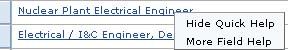
Grr. Apparently it won't let me do that because I'm contained in some sort of database hell within my browser. So I'm given two options, one to close...well, honestly, I don't know, and
the second to get help on the field I clicked on.
Since the first one doesn't seem to toggle anything, I'll try the second.
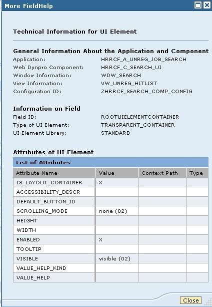
Ahh. Yes, now that is helpful.
I might complain a lot about Taleo, but at least they've got a usability designer somewhere. This system was put together by a database nerd and that's it. It's truly awful.