I had to establish a new password on Taleo's site for Chase.
The password requirements are:
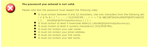
Now to be fair, Chase has decided on the password strength--other Taleo sites do not have this requirement.
These requirements are maddening, particularly because I try to use the same username/password for all Taleo sites (what's in my profile is basically my resume and contact information. Information which I'm not all that worried about protecting, especially considering the fact that there's more about me in public records than what Taleo stores in its site about me.)
Even more maddening, considering the inconsequence of the information stored, these requirements are more than what Chase requires for password strength for online banking (which actually might deserve password requirements like these.)
And a nitpick--all of my "hard" passwords are more than 12 characters long. If you want high password strength, why restrict the length of the password?
I also can't tell if the language "must contain 4 lowercase letters" implies that a password like "abc12XYQ5&" would be rejected because it only had 3 lowercase letters. That would be lame. And if it's not lame, that instruction box is lame.
I'd try to find out by changing my password, but by now I've already forgotten it.
I applied for a job with
NiSource which uses, apparently, a Peoplesoft system for taking in job applications.
This could be a good system, if it didn't do a few things that I thought really sucked.
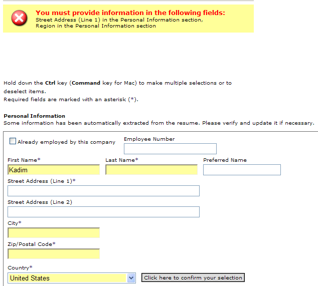
Starting with this confusing screen:
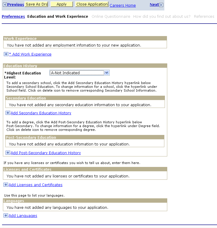
There's something about the design of this page that makes things a bit obtuse. The copy explaining what to do is terrible ("To add a secondary school click the Add Secondary Education History hyperlink below secondary school education.")
The workflow is odd (I think education is a better choice to add before work experience, not after...note, this system doesn't do importing from the resume so it's a lot of repetitive work) and the letter codes in front of the selections with "Highest Education Level" make me think I should be matching them up with something.
Also frustrating, I don't know why they insist on using the terms "secondary" and "post-secondary" to refer to what's normally just High School and College. The reason I find their terminology confusing is that, often, these types of websites don't bother asking where you went to high school. And while I understand that "secondary education" has historically referred to high school, I find that usage bizarre and archaic given the fact that the entire K-12 experience is, today, considered holistically one thing, and then college something afterwards.
So I assumed, incorrectly, that "post-secondary" referred to graduate school. Once I had that straightened out, I found myself chuckling at the following:
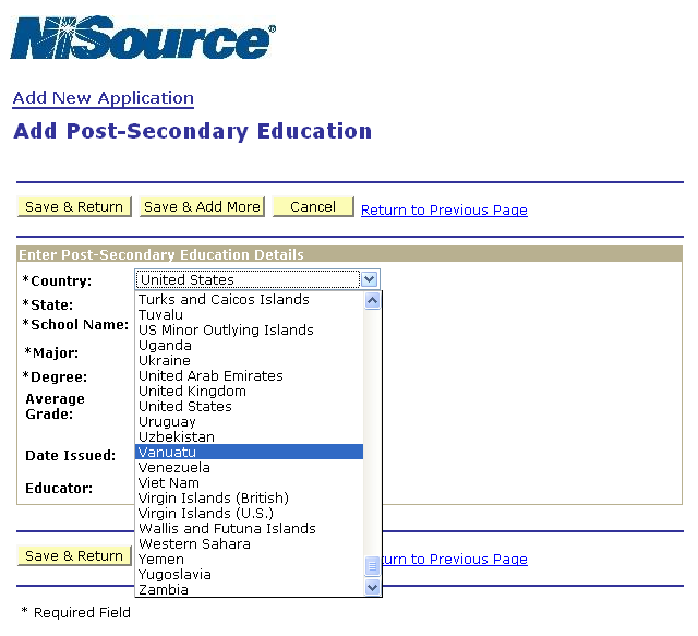
Why does this need to be a drop down list? How does that help anyone? Why can't you just have it as a field? Oh, it might make sense as a drop down list, if that list then filtered the schools in that country for the next drop down (a terrible design for higher education given that there are so many...just give me a damn field to enter this information into!) But no, it's not a filtering mechanism, this is just a drop down field with every country in the world listed.
Like Vanuatu. The inclusion of Vanuatu is not done in vain; there is a university in Vanuatu.
However, as far as I can tell, Western Sahara doesn't have a college or university, and neither does Tuvalu. Wikipedia says that Wallis and Futuna has an unaccredited university as of 2005, which by all means puts them ahead of Tuvalu.
You're allowed to click through all the screens to the end without entering in any information. I thought I was going to get off easily until...
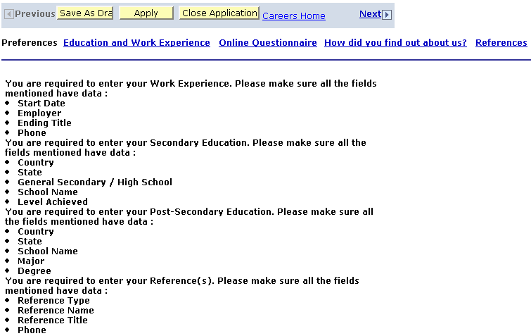
Damn. I kind of appreciate it allowing me to click through mandatory information but then again I think I would have appreciated more knowing what was mandatory and what wasn't at the beginning.
Amusingly, once I did enter in the information it wanted, this error screen still came up, though it allowed the information to be submitted. Strange.