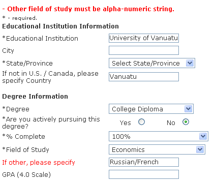
Yeah, I could have solved this issue by saying "Russian and French." (Though the former is a major and the latter is a minor, which this form doesn't take much into account, not that it matters.) However, why does the field need to be so persnickety? Is it really trying to save some massive SQL database from a technicolor yawn if this particular field carries over with a slash?
Robert Half's internal candidate site proves to be an amusement in other regards. It's a relatively large company with a variety of different divisions (for instance, IT staffing and creative staffing.) I happen to be a potential candidate for both divisions, yet the system wasn't meant for that. That leads to situations like this:
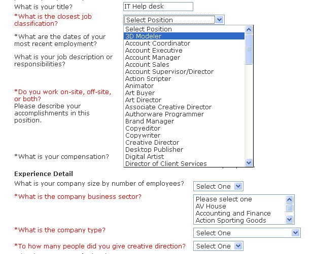
I leave it up to the reader to decide the best answer on how many people an IT help desk employee "directs creatively."
Now I might be an odd exception and you have to give every institution the opportunity for handling exceptions. This system has no internal way of doing it (because I can't delete work experience entries already in there) and the local RHIC office directed me to call their help desk, and their help desk goes to voice mail and I just decided to try another company (nothing seemed to fit me anyway.)
Well that other company ended turning me down. The subject header of this company's email...
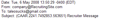
I know it's hard to design email subject headers that don't look like spam. I don't know if that ticket number makes it more like spam or less so. ("Recruiter Message" however does make it sound like spam.) A better system is to reference the job and the company and to skip the damn identification number in the subject header because the information is not that vital to the job applicant. (Though it's fine in the body of the email itself. Actually, I think Taleo does a half way nice job of this, from what I recall.)
In fact, this particular system has a fairly nice, logical looking email, I'm staring at it right now...
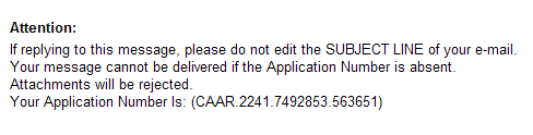
*sigh* Is this really the only way? Well I guess it's not a bad solution from their point of view.
On another job searching expedition, I got this error from a Greatjob.net site (used by Delta airlines)
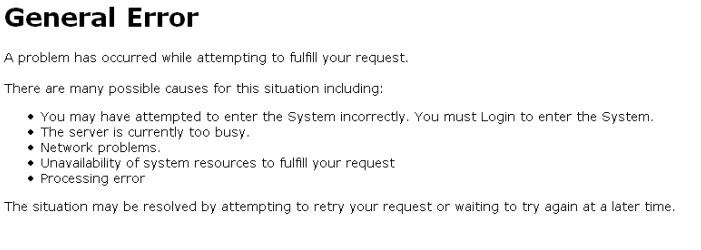
General errors are ugly, and I imagine that if the system actually knew what the error was, it might have prevented the error condition in the first place. So I concede that sometimes all you can do is throw up an error message like this. (Even though I never encounter a general error message on any other site except for Myspace, which handles an unbelievable amount of input/output.)
I'm arguing with myself over what such a page should say...should it spell out all of the problems that might have lead to such a page (such as this page does) or should it just say an error has occurred and what to do? (In regards to this page, I find the first reason rather oddly worded. "You may have attempted to enter the System incorrectly" sounds like this site requires an extraordinary amount of foreplay.)
In any case, what causes the error isn't very important unless different errors create different solutions. Only error condition 1 may require a different solution...the rest of them require waiting or trying again. My quibble is that the system could make it easier to wait or try again. Like...a link that allows me to try again (at least to take me to the most top page that I could have been at.) I'm complaining about this now because there was no way for me to use the back buttons to go back. That resulted in an epic fail and I had to start from delta.com all over again.
I should also add that it's nice if error messages keep with the design of the rest of the site. The starkness of this General Error message, or of Taleo's version of the same contrasts with the rest of the user experience, and it makes one feel like one's suddenly plunged down a deep dark hole. (Compare Microsoft's blue screen of death with the Mac OS X current kernel panic overlay. The reality is that both indicate that the user had indeed suddenly plunged down a deep dark hole. But the Mac OS X kernel panic overlay better adheres to the interface and that reduces the shock, whereas the blue screen of death can't help but shock.)
I haven't mentioned it before (I thought I did but I can't seem to find evidence of it) but if you are involved in the business of making this type of software, feel free to let me know where I'm completely mistaken. Defend your products if you must, I don't care. Funny, I made this originally as a way of ranting out my frustrations, with the expectation that other people who hate Taleo would end up adding to it. Instead, the statistics indicate that the visitors are almost entirely people from companies who make HR software...so...umm...hello. *waves*
No comments:
Post a Comment