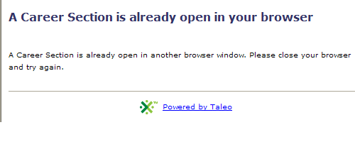
Taleo, of course, doesn't allow you to do that. Why? I dunno, I never run into any other site that doesn't allow this. *Throws his hands in the air having given up on this system a long time ago.*
Back to another Taleo oddity: non-dynamic hierarchical menus
Some websites use a system with a hierarchical series of pull down menus. Choose a menu selection in a top pull down, and then it dynamically changes the selection choices in the second menu. Tirerack.com has a good implementation of this.

So when I choose Ford...
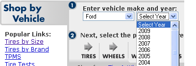
Oh, would you look at that...possible years of Ford vehicles appear. Obviously once I select a year...
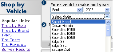
A new pull down menu with the actual models for that year appears. It's lovely and intuitive and works well in comparison to Taleo's weird system...
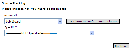
Which for some reason requires that you press a separate button confirming the selection you've made before it propagates the next pull down menu. Honestly, I think Taleo is the only system with this weird setup, why it can't learn from what other sites are doing I don't know.
Finally, I had to be amused by this moment of mediocrity.
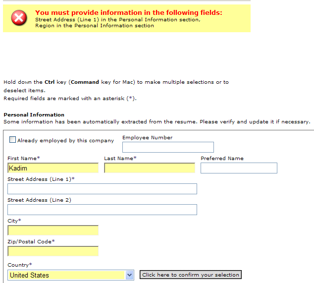
It would seem logical that fields in yellow are required. That does seem to be the case, but there are also fields *not in yellow* which are required as well. What's the difference between yellow and non-yellow fields required fields? I can't say. I think it's just a bug. (I think highlighting the yellow is fine, it works fabulously, but jeez guys, make all the required fields yellow.)
3 comments:
I totally agree about the multiple windows being open. That's just plain crazy.
But on the other two, let me offer a little insight. I work for a competitor of theirs. On the dynamic dropdowns, that auto-generation of the dropdown options is a no no according to the Section 508 compliance rules for accessibility. That being said, what a lot of companies don't realize is that they can have so long as they provide an alternate way to do the same thing. So, for instance, they could leave the button there for people with javascript turned off but still have it dynamically load for everyone else. But many companies choose to code to the lowest common denominator to keep their costs down.
On the yellow background for required fields: Could it be that you have some sort of auto-fill feature on for forms? We see this a lot when talking to users. Google Toolbar will highlight in yellow all the fields it can reasonably guess from the form that the toolbar has the info to populate with. Just a thought.
Keep up the good work!
Interesting on the accessibility issues, I shall have to keep that in mind, thank you.
As for the auto-fill, no, I don't have any auto-fill. I think that (the yellow fields) really came from Taleo.
Anonymous is correct. The yellow fields come from your setup. Probably Google toolbar. They recognize html inputs having know labels (name, password ...) and color these fields in yellow. You can test this using any form on any site having an input whose label is name for example.
Post a Comment